To frame or not to frame: Episode 6

By on July 6, 2026

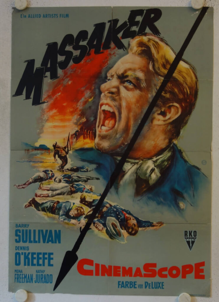
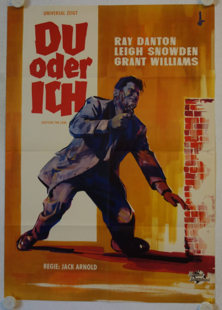
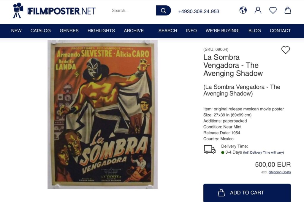
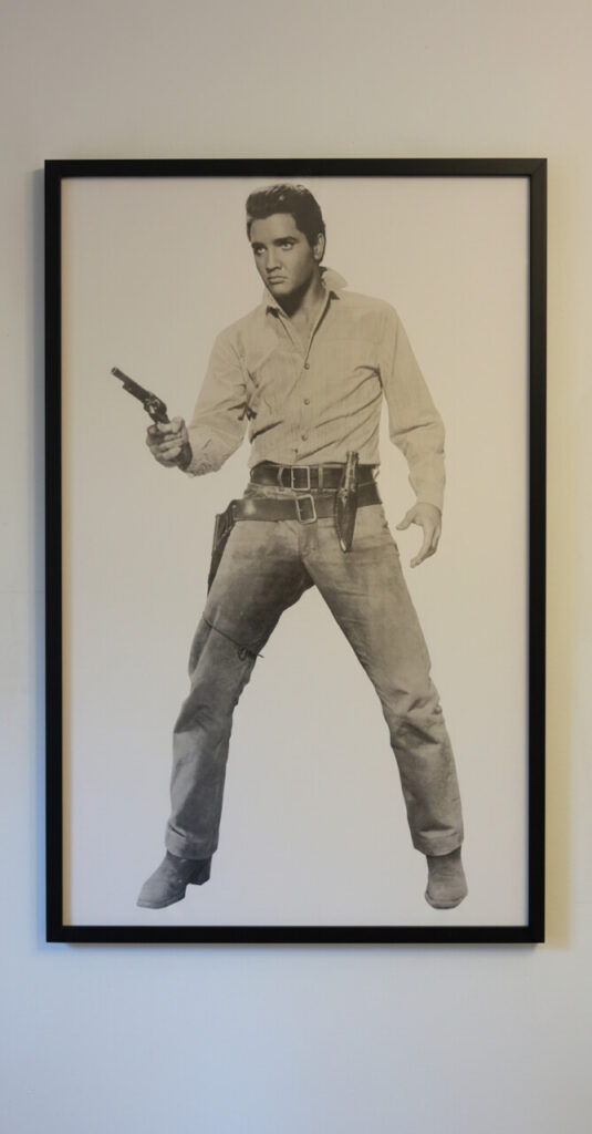
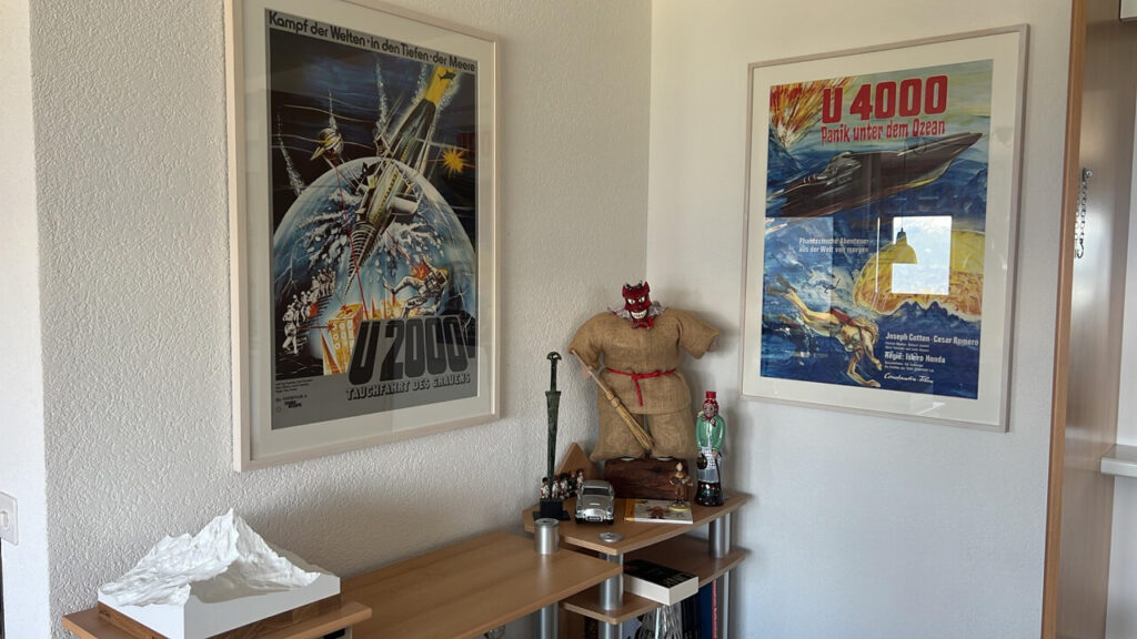
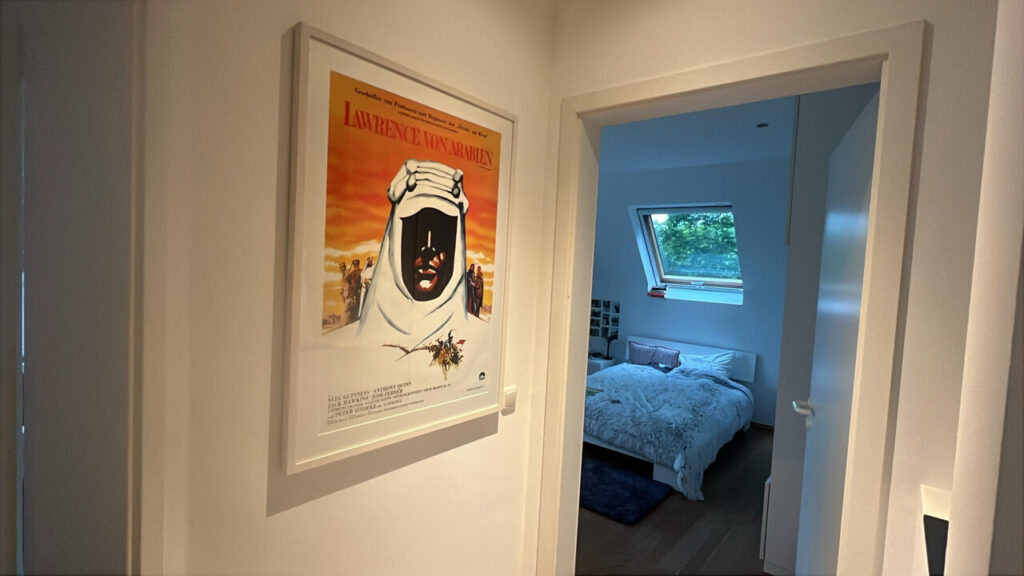
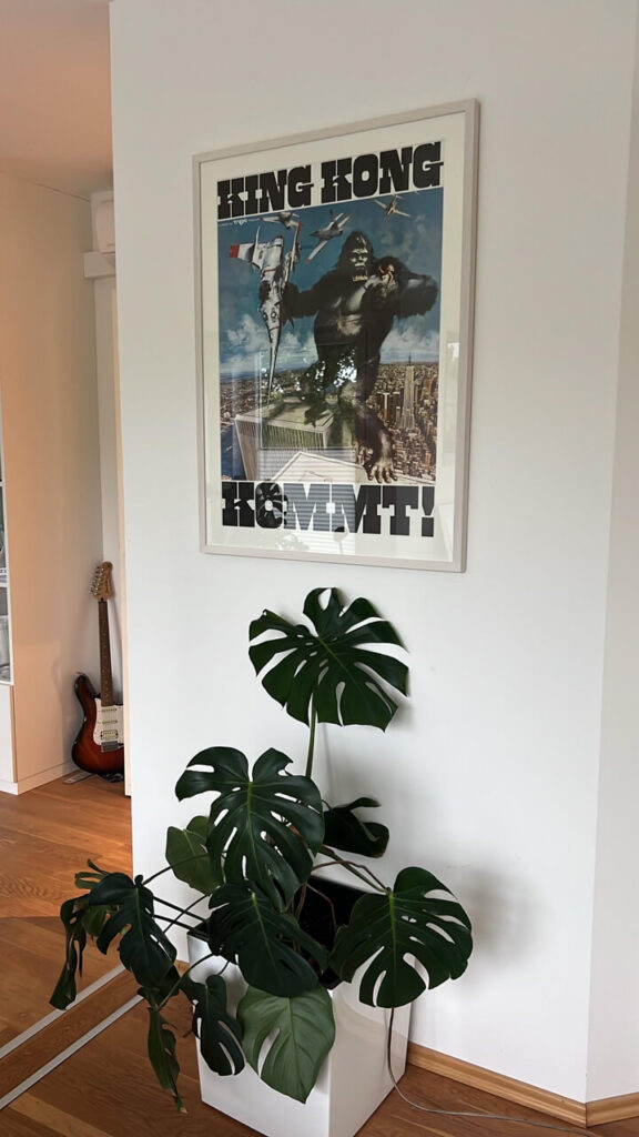
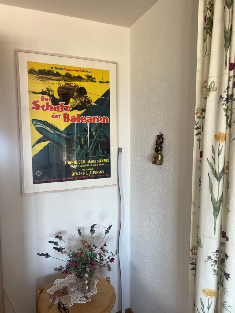
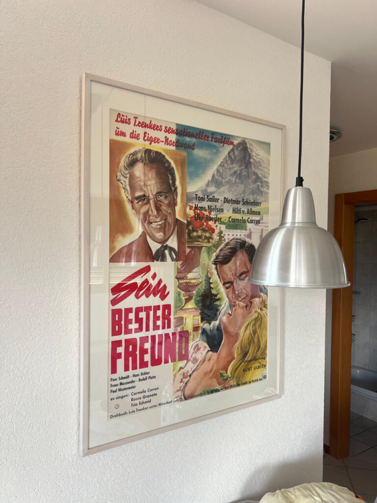
Here’s perfect proof that original movie posters can be both extremely affordable and, if properly framed and displayed, extremely decorative. All of the posters shown here cost less than €100, most of them a lot less. The client decided to keep it simple and opted for identical grey frames with a discreet white matting on all of them, which perfectly allows the posters speak for themselves. Very well done indeed!

Continue Reading

To frame or not to frame: Episode 5

By on June 29, 2026

As you may have guessed by now, the Postercowboy is a man of high standards. I strongly believe that everything worth investing a serious amount of time and/or money is worth to be done RIGHT.

When it comes framing vintage movie posters, 90% of the time a simple, straightforward approach will work best. I have shown a couple of examples earlier in this thread.

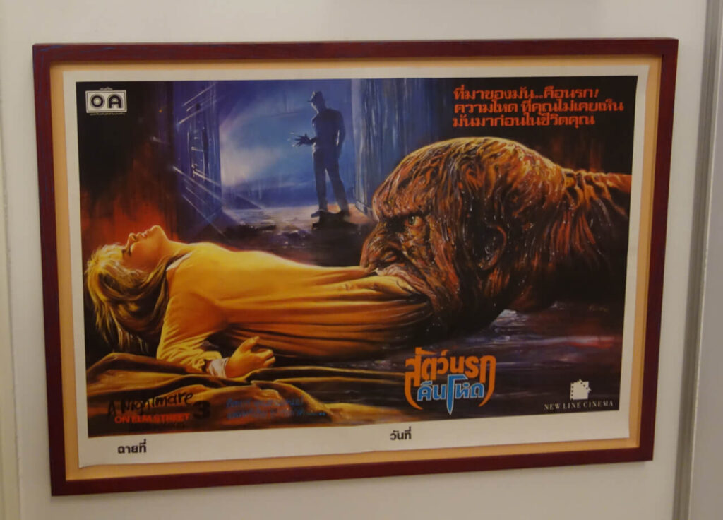
That said, every now and then, something comes up that cries for a ‘special treatment‘. For me, a perfect example is the original release Thai poster for A NIGHTMARE ON ELM STREET 3: DREAM WARRIOR shown below. The movie was the third entry in the Freddie Krueger franchise, and (of course) it does not even come close to original. That said, for me this is definitely the best movie poster for the entire series. According to his website, this is also one of very few NIGHTMARE memorabilia Robert Englund has on display in his home, so I guess he feels the same way.

I had three of these, I sold one, I kept one for my permanent shop exhibition and I as of this writing I still have one for sale. If it is still in stock you will find it HERE.

As stated above, when I decided to have this poster framed I knew I had to do something special and ‘off the beaten path.‘ FRAME WORKS may not be Berlin‘s cheapest custom framer, but when it comes to ‘special projects‘ Claire is always my first choice.

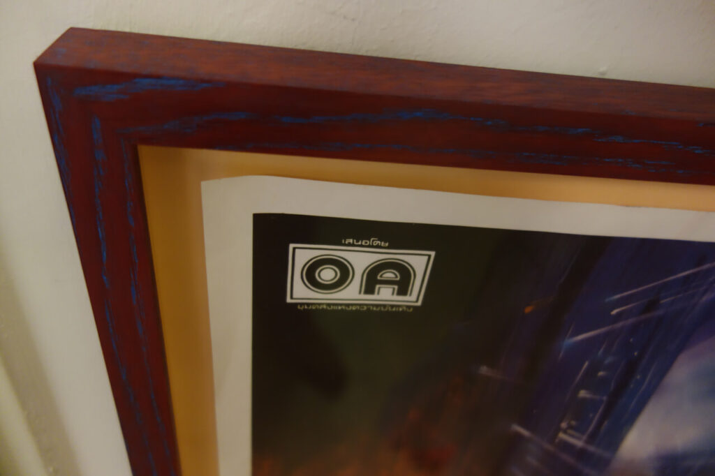
I had a vague idea where I wanted to go with this one, and when I showed her the poster, Claire immediately came up the frame you see below. This is an oak frame that has been painted blue, sanded down and then received a second coat in red before it was sealed with a final waxing. The two-tone color works amazing with the natural oak grain. To take a little credit here, the butternut backing was my idea. I couldn’t really catch the details on the digital image, but in person the final result is absolutely stunning.

I had hundreds of movie posters framed over the last 30 years, and this one is definitely the wildest frame I ever commissioned. It‘s also one of the most beautiful frames I had ever built.

Continue Reading

Movie Poster Censorship on Pinterest

By on June 15, 2026

Over the last 30+ years, Galerie filmposter.net has handled a large number of the nicest and most visually appealing vintage movie posters out there. Which includes numerous seriously expensive pieces, but also tons of posters that are visually striking, regardless of their market value. I‘m showing a number of them in the ARCHIVE section of this website, but I am well aware that I only have a fairly limited reach.

So I figured it about time to set up with Pinterest and create my own pinboard, and here it is:

Unfortunately, my start on Pinterest was not exactly what I had hoped for and actually quite a letdown: Wictor Górka (1922-2004) was a co-founder of the so-called Polish School of Posters. Over the years he created more than 300 posters. His most memorable work is the 1973 Polish movie poster for CABARET. I have laid a ‚reference link‘ on the image, but due to a Pinterest block, it will NOT show this listing, although it is still there. Also, you will need to click on GALERIE FILMPOSTER.NET in the header twice to actually access MY gallery. The first click will once again take you to a random selection of images.

Not only to me, this is one of the most important movie poster designs of all time, and for decades it has held a safe place in my personal 100 BEST MOVIE POSTERS EVER list. (Which is not an actual list at all, but you get the idea.)

You don‘t have to be a movie poster fan to recognise this for what it is, an absolutely iconic graphic design and an outstanding work of ART. Furthermore, it perfectly captures the essence of the movie.

This image was up on Pinterest for roughly 48 hours when they flagged it as ‚Aktivitäten aus Hass‘ which roughly translates to ‚hate-fueled activities‘.

For those of you who have not seen it, CABARET has been labeled ‚the last great American musical’ It is set in the days of the Weimar Republic and while the rise of the Nazis to power plays an important role, this is basically a love story.

Pinterest did not go as far as delete it entirely, but due to the ban the image will not show in their search results. Which is also the reason that the image cannot be accessed through the direct link above. For what it‘s worth, I tried to appeal their decision. Stupid is stupid does, my appeal was turned down and Pinterest stuck with their block.

Honestly, I don‘t even know what to make of this. Is it even stupidity? Ignorance? A general disregard for art? These days, it is hard to surprise me anymore, but in my book, Pinterest has marked a new low here.

By the way, if YOU want to add this original work of Polish Hate Art to your collection, as of this writing the poster is still AVAILABLE.

Be that as may, having an online pinboard to showcase some of the nicest movie posters I have sold in the past as well as a selection of my current inventory remains a nice idea, so (as time allows) I will keep adding images to the Pinterest board.

Continue Reading

THE DARK CARNIVAL Exhibition Spotlight #2

By on June 8, 2026

THE DARK CARNIVAL is the permanent exhibition at Galerie filmposter.net. In a way, it is summary of more than forty years of collecting and probably also an expression of some of my personal trials and tribulations.

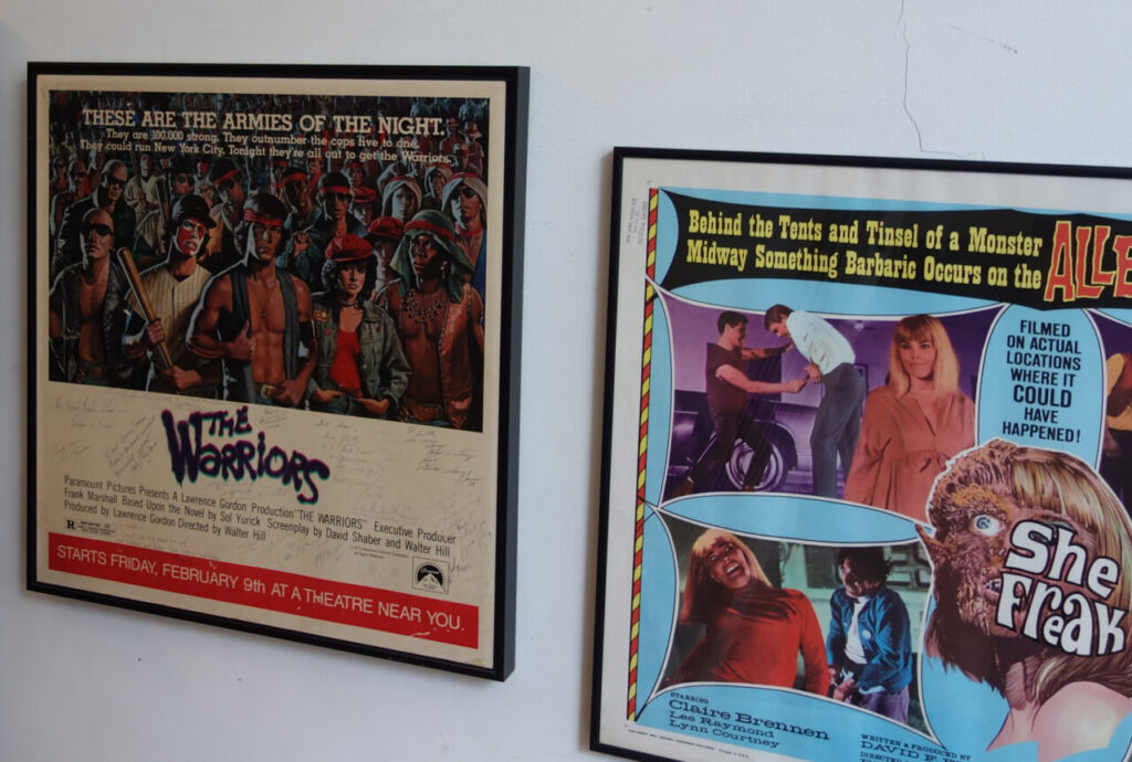
In a previous post, I told the story of my WARRIORS subway window card. which is part of the ‚Coney Island Line‘ section of the show.

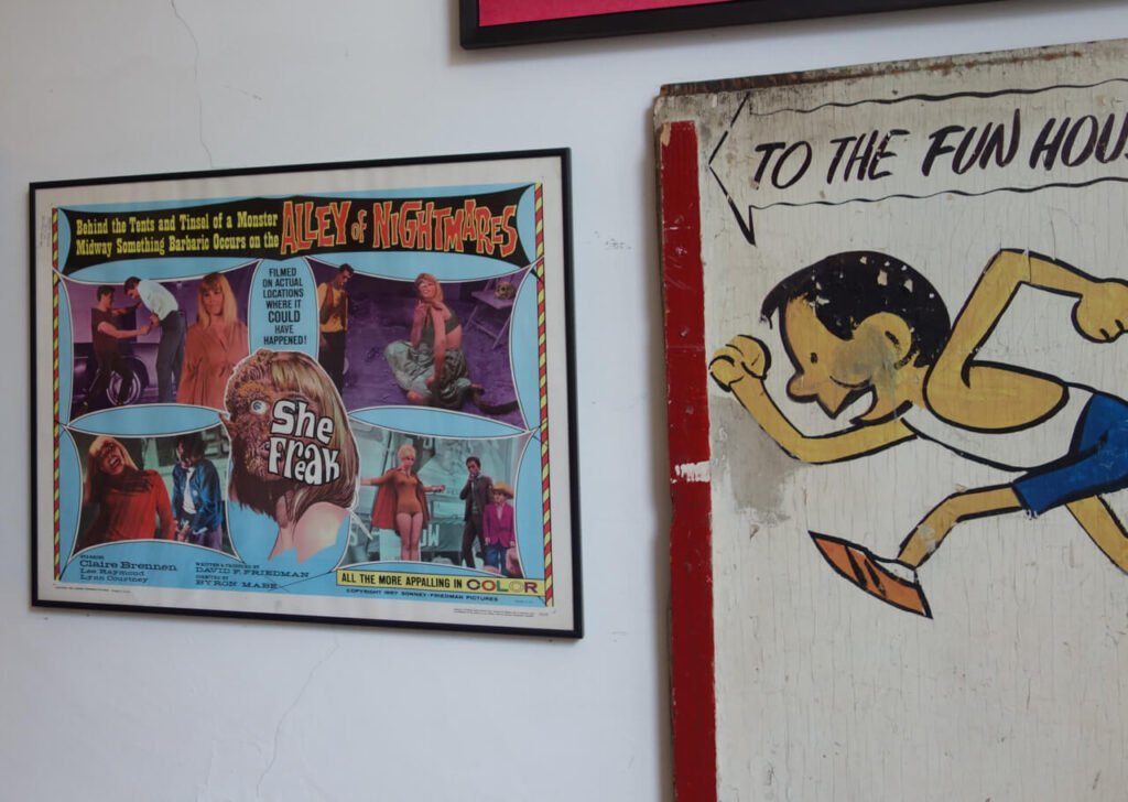
The ‘Anchor Piece’ of this section is a vintage wooden sign that originally showed the way to the Fun House on Coney Island. The original Fun House closed down in the 1960s, so this sign must be from the 1930s or 40s:

As we can see, the young run is running from the rain. A ‘Shadow of Death’ in form of a US premiere poster for Jean-Luc Godards SYMPATHY FOR THE DEVIL is looming over him, so we already have a feeling that his story might not end too well.

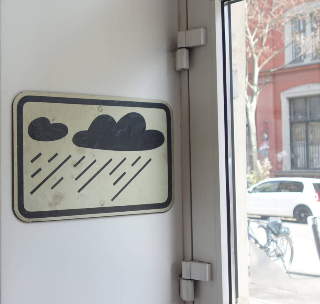
The metal ‚bad weather warning‘ sign was a gift from my ex-wife, and we both have no real clue what this is exactly. She had had it for a long time and eventually gave it to me as a birthday present. Allegedly, this is an actual traffic sign from somewhere in the world, but further details are unknown. It‘s looks great, though and I love it:

Being American, the young man of course came by car. As the license plate illustrates, he apparently came in a 1970 Dodge Challenger originally used in VANISHING POINT:

For those of you who care what happened to Dodge Challengers used in the film later on, click HERE for a sad but rather interesting background story.

Given the parking situation on Coney Island, I guess our hero might’ve had quite a long way to run. On his way, he has to pass the SHE FREAK and other sideshow booths on the Alley of Nightmares:

Good for him, the local gang is of the more friendly persuasion:

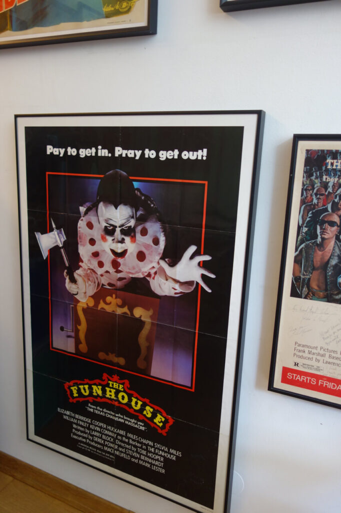
Not so good for him, his final destination is not the kind of place he had imagined:

We have no way to tell what exactly happened to him, but legend has it that the young man has not been seen again ever since.

Continue Reading

The Hunchback of Norderney Revisited

By on June 1, 2026

Following up on last week’s post, I was surprised to learn that Charles Laughton’s HUNCHBACK OF NOTRE DAME actually had a limited regional release on Norderney Island in the 1950s:

Other than the regional title, the Norderney style poster is perfectly identical with the general release German movie poster from the first re-release, c. 1956 from RKO Pictures.

Both styles show the same artwork by Will Williams:

The Norderney version is most likely one of a kind and not for sale. The other one is actually extremely rare as well and will go up on the website with my next update, probably in July. I am open for inquiries, though.

Continue Reading

The Mysterious Island of Norderney

By on May 25, 2026

Norderney is one of the East-Friesian islands in the Northern Sea and was the destination of the Postercowboy‘s latest field trip. It’s only about 50 minutes by ferry from the German mainland, and at some point, it might’ve been the perfect place for time-out. Unfortunately, about twenty years ago, two brothers decided to use a part of their billion dollar inheritance to ‘modernize’ the island. In consequence, everthing has become ridiculously expensive and Norderney is now another hotspot for mass tourism. The approximately 6,000 locals who live on the island (the investor brothers NOT among them) now have to deal with roughly six million tourists every year. Needless to say, real estate prices have gone through the roof as well, so many people who work on the island can’t afford to live there anymore.
The investors’ latest project is another big hotel, which will close the last available open spot. They claim it will NOT be a 5 Star place for the super rich, but it will have large rooms and suites. Plus a shopping mall and a few (no doubt much smaller) rooms for the live-in servants. Uh-huh.

Mrs. Postercowboy overheard a local lady say something like: ‘When I came here in 2002, it seemed a good idea to live in a place where others spend their vacation. These days, it feels a lot like Alcatraz.’ Frankly, I felt the same thing. Just like Alcatraz, Norderney is so close to the mainland that freedom is always in sight. Yet, for those who are stuck there, it can be impossible to reach.

On Norderney, tourists are technically not allowed to drive around in their car, but they are a allowed to bring it over. With the additional foot and bicycle traffic, that’s A LOT of action. Still, all those real-live horrors aside, Norderney does have its charms and it offers lots of inspiration for the movie and movie poster lover.

With all those unusually small houses, narrow streets, the busy buy nevertheless oddly quiet atmosphere and all those Germans strolling about for no good reason, it very much reminded me of ‘The Village’ in the 1967 British TV series THE PRISONER:

With the Postercowboy in the role of Number 6, desperately trying to get back home:

Another letdown was our accommodation. What I had hoped for was something like this:

What I got was this:

The place made me feel like THE HUNCHBACK OF NORDERNEY:

Or perhaps the Somnambule in THE CABINET OF DR. CALIGARI:

Look at this seemingly harmless picket fence. A place of scenic beauty to some, a reminder of the opening scene of BLUE VELVET to others:

Always a good sport, here‘s the Postercowboy doing his best trying to blend in:

For some reason, Norderneyers are not too fond of street numbers, they prefer to give weird and sometimes creepy names to their houses instead:

As if The Prisoner, Dr. Caligari, Blue Velvet and houses with weird names had not been enough, Mrs. Postercowboy pointed out a building that could have served as the perfect location for Alfred Hitchcock‘s THE BIRDS. With the constantly screaming doves providing the soundtrack.

It’s hard to see on the photo, but they even have frigging birds behind the upper left windows!

Also, take a look at the weird thing in front of the house: MAYBE this is just an oddly shaped street lamp. Compare it to an image of the Martian war machines from THE WAR OF THE WORLDS that can be seen HERE and decide for yourself. What makes this even more disturbing is that these things are buried in the sand all over the island…

As if that had not been enough, I learned that very few people dare to let their dogs run free on Norderney, and apparently for good reason, as they tend to end up like this:

Needless to say, the Postercowboy took the first chance he got to flee from this island of horrors and is now more than happy he made it home safe to Berlin.

Continue Reading

The Edward H. Bohlin Lone Ranger Belt Buckle

By on May 11, 2026

We’ve already covered tops and bottoms of the ‘true’ cowboy outfit here, so I figured it is about time to focus on the center: Here’s a short excursion on the cowboy belt buckle.

Belt buckles come in all shapes and sizes, and, needless to say, in wide range of prices as well. Starting with $5 brass buckles, custom made options are available online for as low as $99, with the top line of diamond studded silver and gold going up in the ten thousands.

The Postercowboy usually likes to buy ‘top shelf’, but unfortunately lacks the necessary income to go completely crazy. While Richard Stump’s buckle designs (richardstumpjewelry.com/) are absolutely adorable, they are clearly out of my reach. And as much as I like to look at them, I can’t really see myself walk around with a $30,000+ buckle on my belt. And, truth be told, they are also more than a tad too bling-bling to suit my style. I have seen them advertised as ‘wearable art’ and while I perfectly agree with that, I ran out of wall space a long time ago. So getting one of them framed is not an option either.

Also, the Postercowboy is not only tradition and fashion conscious, he also loves all things vintage. Furthermore, he loves things that actually mean something.

With that in mind, today I want to show you one of my all-time favorite belt buckles. This is a three-piece ranger set, made by the Edward H. Bohlin company in Hollywood. Bohlin was a Swedish immigrant, and a self-made millionaire. Starting out in the 1920s, his top of the line designs and craftsmanship made him famous. He created high-grade buckles, saddles, and other silverware for many of the big stars in Hollywood, including Hopalong Cassidy, Gene Autry, Roy Rogers, Dean Martin, and Robert Redford.

Shown here is an older set that was made in the middle of the 20th century, most likely in the 1950s when this model was most popular:

This is one of company’s earliest designs. It is called the Bohlin #5, and has been in constant production since the 1920s. It was made from 925 sterling silver and is fully hand engraved.

What makes this TRULY SPECIAL for the Postercowboy: This is the exact same style that Clayton Moore wore as THE LONE RANGER both in the original TV series that ran from 1947 to 1959 and the two feature films. (Click HERE to see the original US Onesheet, the original German poster, the best German lobby card, and a US scene card for the first film.)

I have a few single piece buckles, but I always wanted ONE ranger set, and for me, this is the one. As far as I’m concerned, nothing comes even close to it.

Below is a nice shot of the Lone Ranger on a British 7″ vinyl single I found on ebay. THE ADVENTURES OF THE LONE RANGER originally came out as a single 12″ record in the US, but Brunswick (the UK outlet for Decca Records) decided to release it as three extended play 7″ singles in the UK. These are not really worth any money, but they are actually quite rare. As was common at the time, the cover image was hand-tinted, which explains why both the Lone Ranger’s buckles and his gun are gold, where they should of course be silver.

Clayton Moore also wears the bigger version of this buckle on his gun belt, but this is still Berlin, so even I have to limit myself at some point.

Besides the Lone Ranger angle, there’s one more thing I absolutely love about this buckle, and that’s the craftsmanship. This set is handcarved, and it boasts with tiny micro-details. To give you an idea of the size: The small keeper is 1″ wide, the tip about 3/4″. The digital camera brings them all out very nicely, but many of these details are so small, they are actually not easy to see with the naked eye. If this was a painting, the smallest engravings seen here would be done with a one-hair brush.

If there are still craftsmen out there who do this kind of work, they do not work for the current owners of the Bohlin company. I have seen detailed images of a contemporary version of the #5 buckle, and while it still looked ‘nice’, it also lacked all the tiny details that set this piece apart. I have noticed the same thing with other Bohlin buckles as well, it seems the quality is just not there anymore.
Not really a surprise I guess, it’s merely another example of what happens once the ‘investors’ take over.

The buckle came with the belt you are seeing above. With this background story, a black belt is mandatory of course, nothing else would work here. This is a 1 1/4″ belt, tapered to one inch. It was made by the J.B. Hill Company, still one of the finest bootmakers in Texas. This is a top-shelf belt and I guess it would cost you at least $250 these days. And the best thing is, it came in my size!

Below are a few detail images. This could of course be polished for an almost like-new look, but I actually appreciated the vintage patina:

Continue Reading

The Postercowboy Circus Sideshow

By on May 4, 2026

Before finding his final destination as a vintage movie poster dealer, the Postercowboy tried himself in a number of other fields. One of the more colorful (and little known) episodes was a somewhat shortlived career as a circus sideshow performer.

Some people love cowboys and other people love burlesque shows, so bringing the two groups together in a cowboy burlesque show seemed like a ticket to Easy Street.

To cut a long story short, despite a traditional, rather beautiful, handpainted sideshow banner, the idea did not really take off and, to this day, I wonder why. I can only imagine that the idea was once again ahead of its time…

Continue Reading