NEW PACKAGING REGULATION: NO MORE EU SHIPPING

By on August 21, 2026

With immediate effect, Galerie filmposter.net will no longer be able to ship orders to other EU countries. It is still possible to place your order, but you will need to specify a private delivery address in Germany.

Since August 12, 2026 the new EU Packaging Regulation is in force. For smaller businesses, this means having to pay a hefty ransom to be allowed to ship goods to other EU countries.

The biggest problem is that the obligations and costs are largely handled on a country-by-country basis.
I’m already paying an annual fee in Germany for the packaging material I distribute. So today I called the company that handles this matter for me and asked what it would cost to ship to other EU countries. For example, if I wanted to ship to Austria from now on, I would have to pay an annual fee of €274 for an ‘authorised representative’ in Austria, plus a minimum of €150 for the packaging itself, a total cost of €424. This would give me the right to ship up to 1,500 kilos of packing material to Austria every year. Average weight of my packing material is about 0.4 kilos per order, so this deal would allow me to ship 3,750 packages to Austria in a single year. For the record, this month I had exactly two orders from Austria.

And that is just one of the 26 other EU member states.

As we all know, if you pay a blackmailer once, you can hold your breath until he comes back for more.

What probably pisses me off most is that the system places a particularly heavy administrative and financial burden on small businesses selling across borders. Large companies with established operations in multiple countries are obviously in a completely different position when it comes to absorbing these costs.

Honest to God, I’m not a conspiracy nut, but once again this has all the stink of Big Business lobbying about it.

And it’s not only small businesses like mine that will lose money. It will also affect consumers in the smaller EU countries. Who in their right mind would pay hundreds of Euros for the right to ship one or two orders to Slovenia, Malta or Lithuania?

For customers in these countries, this effectively undermines one of the great advantages of the European Union: the ability to buy specialised products from small businesses elsewhere in Europe.

No more vintage or antique goods. No more specialty products from small manufacturers. More and more, people will be left buying from the big players simply because small businesses can no longer afford to sell across borders.

The whole issue is due to be reviewed by the EU Commission in October, and there is hope that a de minimis rule or other simplifications for small businesses may eventually be introduced.

For the time being, however, the rules are in effect. Anyone who simply ignores the obligations and continues shipping across the EU risks enforcement action and potentially substantial penalties.

The Postercowboy has never given in to blackmailers in his life and does not have the slightest intention of starting now.

So, with immediate effect, Galerie filmposter.net will no longer ship to other EU countries.

As stated above, it is still possible to place your order on this website, but you need to specify a private delivery address in in Germany. For the time being, this is the only solution I can see to work around this mess.

Orders to the United States, the United Kingdom, and Switzerland will continue as usual.

GOOD NEWS for buyers in the US of A: Under US law, poster prints (TARIC Code 4911.9100) are considered Informational Materials. Even the World‘s Most Wonderful President Ever is not allowed to limit the free distribution of information by trade embargoes or tariffs.
As the current new regulation shows, the EU Commission quite obviously has no such concerns.

If you want to discuss possible solutions to this mess, feel free to drop me a note.

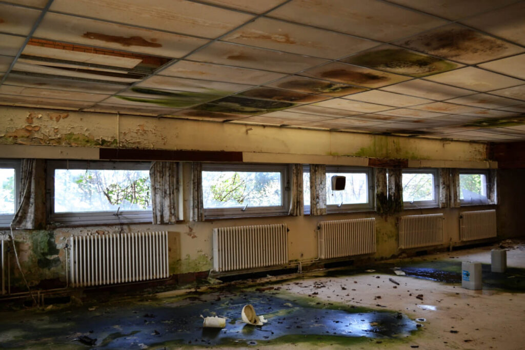
As they say, a picture is worth a thousand words. Here’s the future of many small businesses if this EU regulation stays in effect:

Continue Reading

Movie Poster Spotlight: A Chinese Ghost Story (1987)

By on August 17, 2026

The best movie posters not only decorate a room. They define it.

This wonderful Hong Kong poster for Tsui Hark‘s A CHINESE GHOST STORY is a perfect example:

The film is an absolute classic of Hong Kong cinema and spawned two sequels. The poster is one of my all-time favorites among modern Hong Kong cinema posters. Many Hong Kong posters from the time are somewhat overloaded with text and imagery. More often than not, there is just ‚too much going on‘.

This design is a welcome exception: Simple and reduced to an utmost minimum, yet absolutely striking. Rather than telling a story, the poster introduces the characters like a theatre lineup awaiting the opening curtain. The thunderstorm in the top left signals that we are to expect a fantasy film. The writing is also kept at an absolute minimum and becomes a design element in itself. As typical for Hong Kong movie posters, the title is stated both in Chinese and English.
The vivid red background is not just scenery, it is a dedicated color panel and becomes a statement in itself. A statement that is emphasised by the straight black border.

With app. 24×39 inches, it is on the larger side for Hong Kong movie posters. Usually, a movie poster design has to conform to a standard size. Here, it feels like the size was chosen to serve the composition rather than the other way around. The graphic design of this poster focuses on maximum impact, and the size follows the design.

Any poster can fill a frame. A great poster can fill a room.

This poster absolutely demands a simple black frame, a white wall and A LOT of wall space all of its own. I can perfectly envision it in any kind of modern and/or minimalist environment.

The poster is available for purchase and will go up on the website with one of my next updates.

Continue Reading

Movie Poster Spotlight: Dragoon Wells Massacre (1957)

By on August 10, 2026

Following up on last week‘s post I want to show another ‘perfect’ movie poster today, the original 1958 release German poster for DRAGOON WELLS MASSACRE:

Graphic designer Will Williams was born as Willi Haseneier in Germany in 1922. After the end of World War II he changed his name to Will Williams and migrated to Rome for a few years. He supposedly met directors like Roberto Rosselini and Federico Fellini who introduced him to the great Italian poster artists. His own work is strongly influenced by these Italian masters.
Especially his faces often show a gritty, life-like realism that is hard to match.

The movie itself is basically a run-of-the-mill B-western and tells the story of a wagon train of prisoners that is attacked by Indians. The US campaign was perfectly dull and the posters are generally considered non-collectible.

As outlined in last week‘s post, the sole purpose of a movie poster was to lure the viewer into the movie house. Shortening the title to MASSAKER (which does not need translation) was another smart move by the distributors. In the top right hand we see Dennis O‘Keefe in a US Army uniform, crying out in anguish. The left hand of the poster shows a band of dead soldiers and a dying cowboy. The image is cut up by a stylised Indian arrow and completed by a fire in the background. The necessary credits are shown on a grey background.

There‘s a lot of grey background, which allows the viewer to focus on the three key elements of the poster. Add the striking title and it only takes a single glance to know what we can expect here: An action-packed Indian western with lots of dead white men.

An ordinary western. An extraordinary poster.

The poster is available for purchase and will be added to the website with my next update.

Continue Reading

Movie Poster Spotlight: OUTSIDE THE LAW (1956)

By on August 3, 2026

Director Jack Arnold is of course best remembered for this horror and scifi efforts like CREATURE FROM THE BLACK LAGOON or TARANTULA. At the time, the studio system was still comfortably established. More often than not, studio directors were assigned projects by the studio executives.

There is no way to tell if he actively opted for this one or if it was simply given to him, but in 1956 Jack Arnold directed a little known Film Noir flic titled OUTSIDE THE LAW, which opened in Germany in September 1959 with this poster designed by artist Hans Braun:

These days, posters are not much more than an advertising gadget. Back in the 1950s (and long after) the movie poster was THE main advertising tool. Its sole purpose was to lure potential clients into the cinema.

Unlike many other posters from the period that are often overcrowded with details, this one does a perfect job. Let’s start with the German title DU ODER ICH (You or Me). Three words, four syllables, nine letters is all it takes to give us a first impression what we can expect here: Some gritty action, and perhaps a story of revenge. Which is both true.

This first impression is emphasized by a stumbling guy with a gun in his hand and blood running from his temple. His suit and the stylized brick wall on the right tell us that this is a crime movie, not a western. And the combination of the red title and brown background suggests that we are in for a ‘bloody affair’. Everything about the design promises hard-boiled urban crime. No romance, no comic relief, just a wounded man with a gun and a desperate situation. Doing what a man has to do.
Unless you’re Travis Bickle, this is not a movie you would take your prospective girlfriend to see.

Whether the film ultimately delivers on its promise doesn‘t matter. By then the poster has done the one job it was created for: getting the audience to part with their money.

I have a US Pressbook for Russ Meyer’s MUDHONEY that can be seen HERE. On the posters page it states ‘DRAMATIC ONE SHEETS – STOP THE EYE… OPEN THE WALLET!’

I always loved that quote, and if the purpose of a movie poster is indeed to stop the eye and open the wallet, Hans Braun succeeded brilliantly.

The poster is available for purchase and will be added to the website with my next update.

Continue Reading

How to preserve and store vintage Movie Posters

By on July 27, 2026

Since the topic came up with a client once again today, I figured it‘s about time to write up a few thoughts on the proper preservation and storage of your vintage movie poster collection.

A few years ago, I listened to an art consultant (if that‘s what she was) talking about storing your art collection in an interview on Deutschlandradio. First thing she said was: If you are collector, you have a storage facility. If you do not have a storage space, and everything you own can be displayed on your walls, you are a decorator.

I very much liked this approach, and ever since I have considered myself a decorator, not a collector anymore. These days, I only keep posters (plus the occasional nic nac) I can display, everything else goes up for sale. My store exbition has been ‚basically‘ completed a couple of years ago, but it is quite amazing how I still manage to add yet another small exhibit every and now then. I guess that‘s further proof of my high level of expertise.

Anyway, back to the subject at hand. First of all, let‘s talk about preservation. The necessary effort is pretty much defined by the paper stock the poster was printed on. Fortunately, most vintage US Onesheets as well as West-German posters were printed on very low acidic and very stable paper. Exceptions confirm the rule, but these posters usually do not need any special treatment.

Vintage East-German movie posters were often printed on very cheap, highly acidic paper stock. Somewhat following the example of the country that printed them, you can literally watch these posters fall apart. The only way to stop this is to hand them over to a professional paper restorer for deacifying and linen- or paperbacking. Unfortunately, the associated costs are often in no relation to the value of the poster.

Vintage Mexican posters are even worse: Not only is the paper stock highly acidic, it is also super thin. More than thirty years ago, I owned a noticeable collection of vintage Mexican movie posters and I spent a lot of money to have everything properly preserved and backed on Japanese rice paper. That‘s a very thin 28 grams acid-free paper typically used by museums worldwide. Applying a poster to ‚Japanpapier‘ takes a lot more skill and expertise than linenbacking, and the handful of restorers in the US who are able to do this usually charge brutal prices.
What I personally like about ricepaper backing is that the final result still feels like a poster. Those flimsy Mexican posters feel like ‚normal weight‘ after the backing.

Here‘s one lone survivor from my private collection that was preserved and paperbacked in the late 1990s. Graphically, it‘s one of the Top Ten Lucha Libre movie posters out there:

Fortunately, very few posters require this type of extensive treatment. In most cases, taking proper care of your collection is much, much easier.

The first question is of course: Rolled or folded? If a poster was never folded, the perhaps not so obvious answer is, store it flat. Storing rolled posters in tubes is the most common practice of course. If you do not intend to look at your rolled posters ever again, using tubes is the way to go.
Personally, I do not recommend it as handling rolled-up posters is a perfect nightmare. So unless you‘re willing to accept the fact that you own something and never ever look want to look at them again, storing unfolded posters flat is the way to go.

If a poster has been folded, it is up to you if you want to store it flat or folded, there‘s no right or wrong here.

The main advantage of storing your posters folded is that they will take up a lot less space. Other than that, a poster does not ‚hurt‘ from being stored folded.

One more important fact: Cigarette smoke is poison for vintage paper. It‘s not only the bad smell, cigarette smoke will age the paper and make it brittle. An ozone generator (available for small money from Amazon) can take care of the smell, but of course can‘t undo any other damage.

You don‘t need to build a humidor, but naturally, posters should be stored in a somewhat controlled climate, not too dry and not too moist. Obviously, vintage posters should never be exposed to direct sunlight.

While posters do not hurt from being stored folded, most active collectors like to look at their collections every now and then, and constantly folding and unfolding posters will inevitably harm them over time. For collections that are actively cared for, a flat storage is preferable. Simple acid free cardboard folders can be easily found at any art supply.

If you want to go professional, and the value of your collection justifies the expense, you could have your folders made to your requirements by an archive supplier like Beskid Plus in Poland. At the gallery I use acid-free corrugated boards I had custom made to my required sizes:

In their description, Beskid mentions that cardboard does not protect against bookworms and other insects. Which is of course true, and a major problem for large archives. In most private collections, this aspect can be perfectly neglected.

One last point regarding flat vs. folded: Once the poster has been folded, the damage has been done. I have a handful of posters that have been stored flat for decades and the fold lines have almost vanished. These are very rare exceptions. It will only work with soft, uncoated paper stock and it takes both a lot of pressure and a LONG time for the fold lines to vanish.
Starting in the late 1960s, movie posters were often printed on more or less glossy paper stock. Once these posters are folded, the top coat breaks, leaving those nasty white marks. Regardless of how long you store a glossy poster flat, this damage cannot be undone.

I frequently see ebay listings that state ‚folded but stored flat, will ship rolled.‘ Unless the poster in question is a truly vintage piece, printed on soft paper stock, there is NO advantage in shipping the darn thing rolled. On the other hand, in my experience at least 90% of the amateur and hobby sellers on ebay have NO CLUE how to pack a rolled poster properly. In the end, you will receive a folded poster with border damages and/or crush marks. Well done, ebay seller!

I have said it before, and I will say it again: Once the poster has been folded, the damage is done. So if you want to ship a folded poster that has been stored flat, fold it again, sandwich it in oversized strong cardboard, wrap it in foil in case some idiot mailman leaves it out in the rain, and place it in a cardboard book mailer. DO NOT ship a folded poster rolled unless you know exactly how to protect it.

Continue Reading

Movie Poster Spotlight: FLAMING STAR Lobby Display

By on July 20, 2026

One of the greatest pleasure in the life of this Postcowboy is discovering vintage movie posters he never even knew existed, like this original 1961 release German cinema lobby display for FLAMING STAR I want to show you today:


The poster was printed in three slightly overlapping sections and measures an impressive 88 x 180 cm (app. 34.5 x 71 in). It shows an almost life-size portrait of Elvis Presley as Pacer Burton in FLAMING STAR. The movie opened in Germany on March 17, 1961 and this three-part poster was intended for display in the foyer of large first-run cinemas. Upon its initial release, the movie was not a big commercial success, but today it is widely considered to be Elvis‘ best film.

Unlike the standard A1 poster and the already much rarer large A0 size, this type of large cinema display was seldom used and the format is very, very rare to begin with. This type of multi-part display was printed only for a very limited number of films and exclusively sent to selected premiere cinemas. It was intended for use in the cinema lobby. These large displays hardly ever survived at all. When they had served their purpose, they were almost inevitably destroyed.

Remarkably, this example has apparently never been displayed, which may well explain why it survived at all.
I have never seen this poster before, for all I know so far it has never been offered at auction and it is not documented in any private or public collection. For the time being, I must assume that this might be the only surviving copy. A recent ‚basement find’, it is entirely unrestored and in amazing condition. To my best knowledge, no similar format was produced for this film worldwide.

The design is based on a single publicity still blown up to life-size proportions. The poster was very well printed and the effect is nothing short of stunning. Two years later, Andy Warhol used a similar image from the same photo session for his now legendary (and ridiculously expensive) Elvis series.

In an alternate universe, Andy Warhol visited Germany in the early 1960s, and was inspired to his own Elvis series when he saw this display in the cinema lobby. Unfortunately, in this world, Warhol first visited Germany in 1971, so it is rather unlikely that he ever saw this poster.

The display could very well be considered a ‘Pre Pop Art’ artifact. What certainly IS amazing is that the German distributors quite obviously saw the huge potential in this image. Two years before Andy Warhol did.

One more ‘fun fact’: Elvis was about 180 or 181 cm tall. The Elvis image on the poster measures 177 cm. Add the fact that he‘s standing in a wide stance and beckons slightly to the front, that comes very, very close to actual ‘life size’. Whether that was intentional or is just a coincidence is impossible to say today, but they certainly tried to go ‘as big as possible’.

This poster shows Elvis in his athletic prime, and even sixty-five years after it was made, it has an absolutely amazing impact on the viewer.

Imagine this display expertly assembled, linenbacked and in a simple black wooden frame. Old Magic. Still works.

And since we’ve already started dreaming here: Imagine it hanging next to an original Andy Warhol Elvis print.

Available for purchase. Price upon request.

Continue Reading

Introducing the filmposter.net Waiting Room

By on July 13, 2026

With my big break just around the corner, I figured it’s about time to prepare for the upcoming rush. Here’s the official Galerie filmposter.net waiting room:

So when your next appointment is due, please take a seat. Old newspapers and tab water will be served on request and once Doctor Postercowboy is in the mood to see you, he will call you in!

Continue Reading

To frame or not to frame: Episode 6

By on July 6, 2026

Here’s perfect proof that original movie posters can be both extremely affordable and, if properly framed and displayed, extremely decorative. All of the posters shown here cost less than €100, most of them a lot less. The client decided to keep it simple and opted for identical grey frames with a discreet white matting on all of them, which perfectly allows the posters speak for themselves. Very well done indeed!

Continue Reading

To frame or not to frame: Episode 5

By on June 29, 2026

As you may have guessed by now, the Postercowboy is a man of high standards. I strongly believe that everything worth investing a serious amount of time and/or money is worth to be done RIGHT.

When it comes framing vintage movie posters, 90% of the time a simple, straightforward approach will work best. I have shown a couple of examples earlier in this thread.

That said, every now and then, something comes up that cries for a ‘special treatment‘. For me, a perfect example is the original release Thai poster for A NIGHTMARE ON ELM STREET 3: DREAM WARRIOR shown below. The movie was the third entry in the Freddie Krueger franchise, and (of course) it does not even come close to original. That said, for me this is definitely the best movie poster for the entire series. According to his website, this is also one of very few NIGHTMARE memorabilia Robert Englund has on display in his home, so I guess he feels the same way.

I had three of these, I sold one, I kept one for my permanent shop exhibition and I as of this writing I still have one for sale. If it is still in stock you will find it HERE.

As stated above, when I decided to have this poster framed I knew I had to do something special and ‘off the beaten path.‘ FRAME WORKS may not be Berlin‘s cheapest custom framer, but when it comes to ‘special projects‘ Claire is always my first choice.

I had a vague idea where I wanted to go with this one, and when I showed her the poster, Claire immediately came up the frame you see below. This is an oak frame that has been painted blue, sanded down and then received a second coat in red before it was sealed with a final waxing. The two-tone color works amazing with the natural oak grain. To take a little credit here, the butternut backing was my idea. I couldn’t really catch the details on the digital image, but in person the final result is absolutely stunning.

I had hundreds of movie posters framed over the last 30 years, and this one is definitely the wildest frame I ever commissioned. It‘s also one of the most beautiful frames I had ever built.

Continue Reading